Android users, we can access Google search from several browsers, although the most used is Google Chrome. Today, we will show you the new design in tests of Google Search, which will adopt a more modern design and adapted to the lines of Material Design, imposed by the tech giant Google a few years ago.
This will be the new Google search
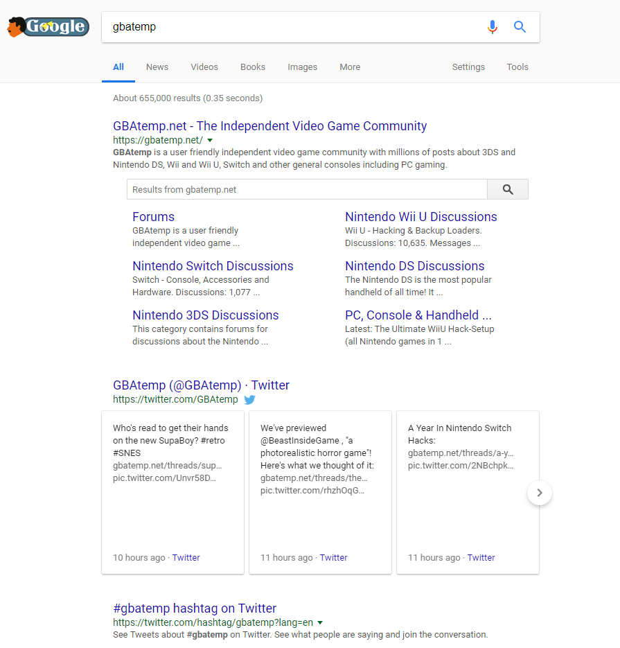
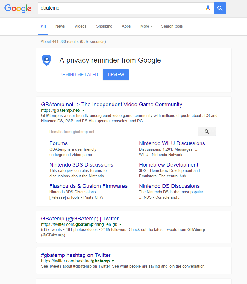
By clicking on the images you will be able to fully appreciate the difference between the old Google search and the new one. As we can read in The Next Web, the tech giant Google is doing tests with this new design, to end up making it the definitive interface of Google searches. The new design has much more marked edges, which allow to distinguish the content in a more simple way. It is not about any radical change in the interface, but the polishing of it, to adapt to the most current design lines, and to maintain the coherence of Material Design. It remains to be seen if this ends up being the final design of Google Search, since being in the testing phase, there may be some modifications before the final version is released. Anyway, we are happy to see that the tech giant Google is still working to improve the design of its applications, and more when it is one that we use practically every day to access all the content that the Internet offers us. So, what do you think about this? Simply share all your views and thoughts in the comment section below.
Δ


